The Design System That Saved Our Team 40 Hours Per Week
How we built a component library that eliminated design-dev handoff friction and saved 40+ engineering hours every single week.
In 2022, I joined a fintech company as their first dedicated frontend architect. They had twelve product teams, each building their own version of a button. Not metaphorically — twelve distinct button implementations, with different hover states, different focus rings, different loading behaviors. One team’s primary button was 40px tall. Another’s was 36px. The QA team had a spreadsheet tracking the inconsistencies.
Eighteen months later, we had a design system called Meridian in production across all twelve products, and we’d measured a consistent 40-hour-per-week reduction in engineering time that had previously gone into UI decisions, inconsistency fixes, and accessibility remediation. Here’s how we did it.
The Problem Was Deeper Than Components
When I started auditing the codebase, I expected to find inconsistent components. I found something worse: inconsistent decisions. Every team had legitimate reasons for their choices. The 36px button team had a density-focused product. The 40px button team had accessibility concerns about touch targets. Nobody was wrong — they just didn’t have a shared source of truth.
This is the real problem design systems solve. It’s not primarily about code reuse. It’s about encoding decisions once so engineers stop making those decisions repeatedly, and making it easy for new engineers to do the right thing by default.
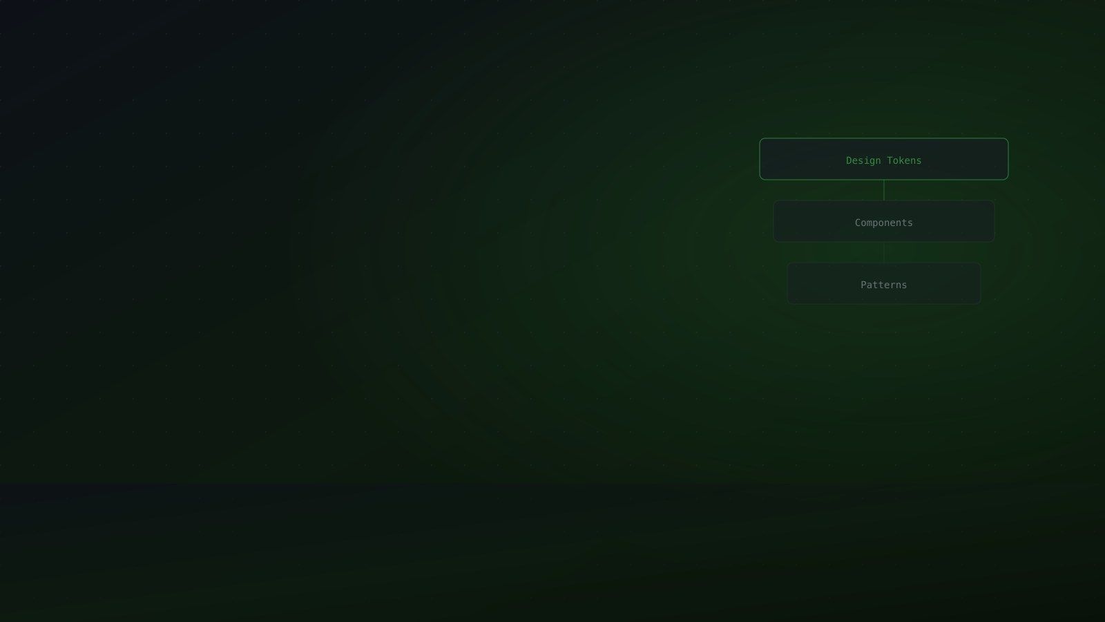
Token Strategy: The Foundation
Before writing a single component, we spent three weeks on design tokens. This turned out to be the most important decision we made.
We structured tokens in three layers, following the Design Tokens W3C Community Group specification:
Primitive tokens are raw values with no semantic meaning. --color-blue-500: #3b82f6. --spacing-4: 1rem. --radius-md: 6px. These are never used directly in component code.
Semantic tokens reference primitives and carry meaning. --color-action-primary: var(--color-blue-500). --color-action-hover: var(--color-blue-600). --spacing-component-padding: var(--spacing-4). These are what components use.
Component tokens are component-specific overrides. --button-height: 40px. --button-radius: var(--radius-md). These allow product teams to customize components without forking them.
This three-layer structure is what makes a design system scale. When the brand team changed the primary blue from #3b82f6 to #2563eb, one token update cascaded correctly through every product. No component code changed.
Component API Design
We made four non-negotiable rules for component APIs:
No style props. A <Button color="blue"> prop is a design system anti-pattern. It leaks implementation details and encourages one-off customization. Instead, variants: <Button variant="primary">, <Button variant="secondary">, <Button variant="destructive">. Variants are pre-approved design decisions.
Accessibility is not optional. Every interactive component ships with ARIA attributes by default. <Button> has the right role, <Modal> traps focus automatically, <Select> has keyboard navigation. Teams can’t ship inaccessible components by accident.
Composition over configuration. Instead of a <Card title="..." footer="..."> component with fourteen props, we ship <Card>, <CardHeader>, <CardBody>, <CardFooter>. Teams compose what they need. The component does less, but it’s far more flexible.
Explicit forward refs. Every component uses React.forwardRef. This sounds like a detail, but it’s what allows teams to integrate our components with animation libraries, focus management systems, and testing utilities without workarounds.
The Storybook Decision
We evaluated several documentation tools and chose Storybook, but we used it differently than most teams do. Rather than treating Storybook as a design reference, we made it the source of truth for component contracts.
Every component has stories for: default state, all variants, all sizes, all states (hover, focus, disabled, loading, error), edge cases (very long text, empty state, internationalized text), and accessibility assertions using @storybook/addon-a11y.
When a designer wants to propose a new variant, they prototype it in Storybook first, using existing tokens. When an engineer implements it, the story is the spec. This eliminated the “I thought it should look like this” conversations that used to dominate design reviews.
Automated Visual Regression with Chromatic
The single biggest driver of adoption was Chromatic integration. Every PR that touched Meridian automatically generated visual diffs for every affected story. Reviewers could approve or reject visual changes with one click.
Before Chromatic, engineers were afraid to touch shared components — a well-intentioned fix might break something in a product they didn’t know about. After Chromatic, they had confidence. The system would tell them if they’d broken anything visual.
This reduced PR review time for component changes from an average of 3 days (waiting for manual QA across products) to 4 hours.
Adoption: The Hardest Part
Building a design system is the easy part. Getting twelve teams to use it is the hard part.
We ran a “migration sprint” for each product team — one week where a Meridian team member paired with the product team to migrate their highest-traffic components. This did three things: it transferred knowledge, it surfaced edge cases we hadn’t anticipated, and it created internal champions on each team.
We also had a strict rule: we never forced migration. Teams adopted Meridian because it made their work easier. When it didn’t, we treated that as a Meridian bug, not a team problem.
Measuring 40 Hours
Twelve months after launch, we surveyed engineers across all twelve products about time spent on UI-related decisions, inconsistency fixes, and accessibility remediation. Before Meridian, the average was 6.2 hours per engineer per week across 65 engineers. After, it was 1.8 hours. That’s a reduction of 4.4 hours per person, times 65 engineers: 286 hours per week reclaimed.
At an average fully-loaded cost of $120/hour for a senior engineer, that’s $1.77 million per year in engineering time redirected to product work. The entire Meridian project, including the 18 months of build time, cost less than half that.
The 40 hours figure I use is conservative. It’s based only on engineers, not design time saved, not QA time saved, not the reduced bug rate from consistent accessibility implementation. The real number is higher.
Design systems are infrastructure. Like good infrastructure, the cost of building them is obvious and the cost of not building them is invisible until it becomes catastrophic. For teams where UI consistency is solved but performance remains a blocker, the same compound-improvements logic applies — the Core Web Vitals guide walks through how systematic fixes add up across LCP, CLS, and INP.
If you’re building a product team that needs this kind of investment, the services page has details on how I approach design system engagements — from token strategy through to team adoption.
Further reading: Design Tokens W3C Community Group · Storybook documentation · Chromatic visual testing · Nathan Curtis’s Tokens in Design Systems